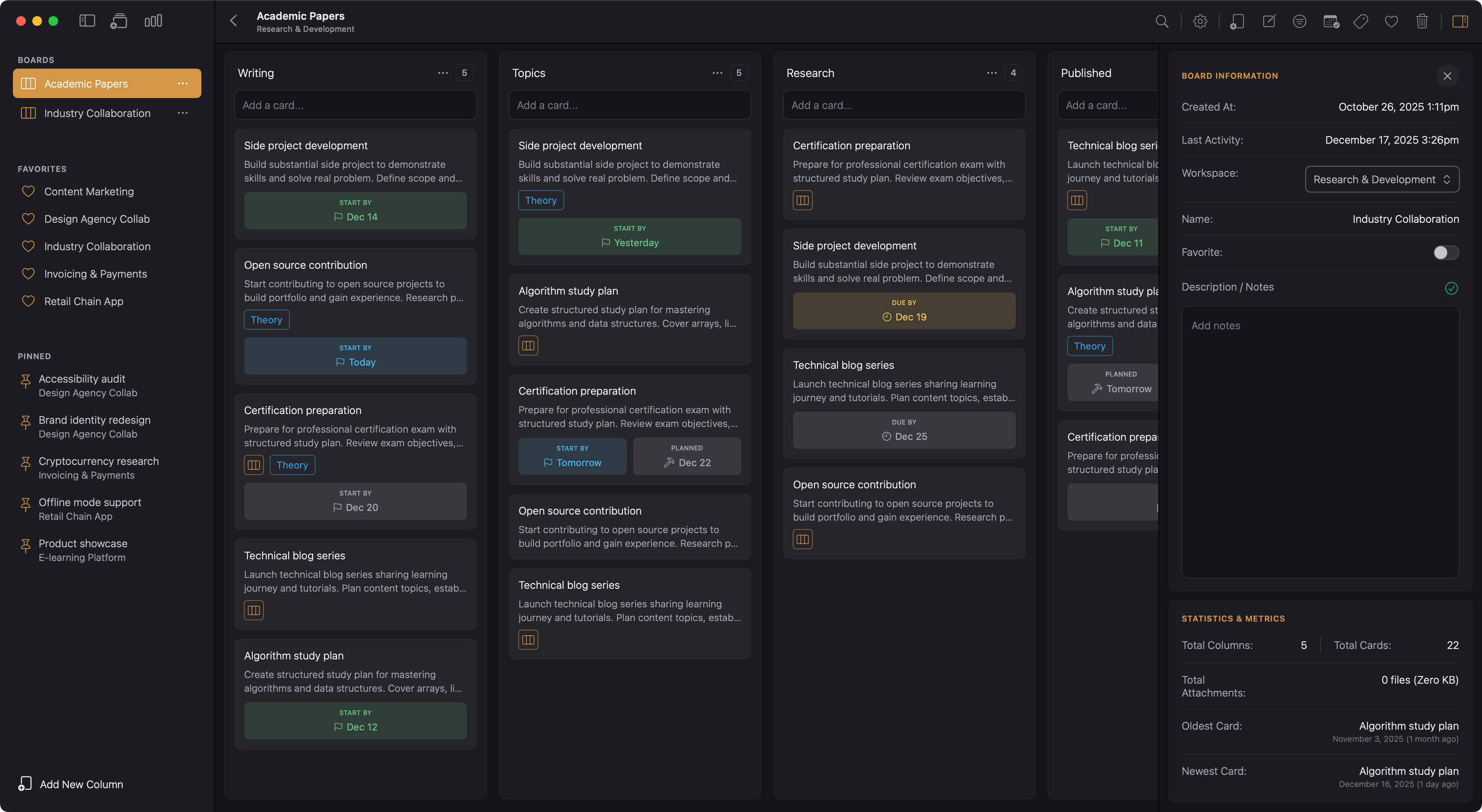
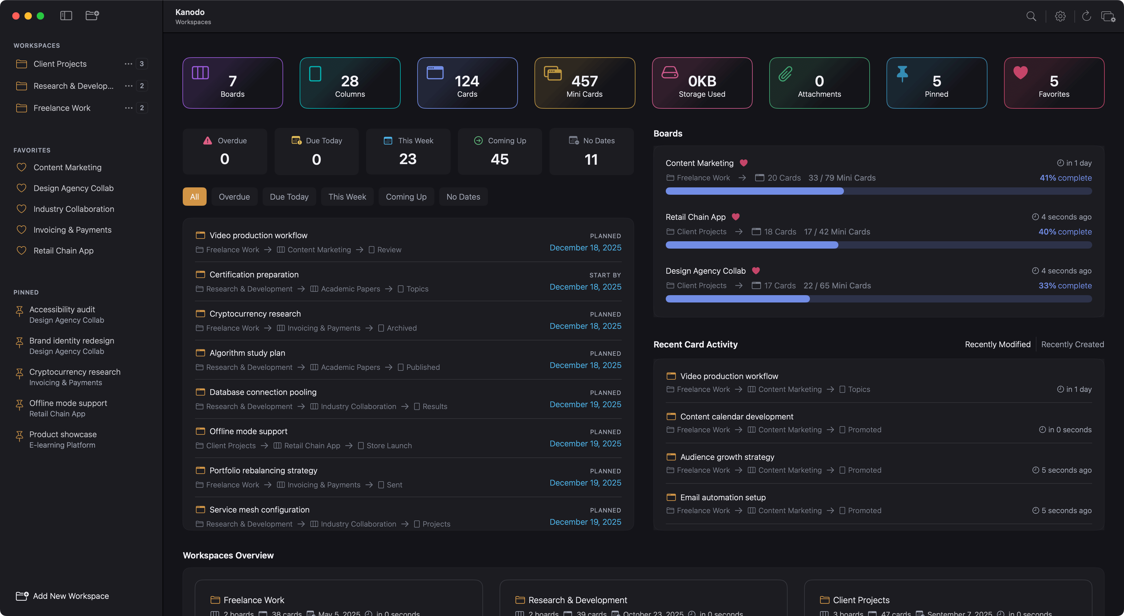
Cards are the fundamental units of work in Kanodo. Each card represents a task, idea, note, or any item you want to track. Cards live within columns and contain rich information including titles, detailed content, dates, labels, file attachments, and even nested mini-boards for complex tasks.
Understanding cards
A card is more than just a task title. While you can use cards simply as brief reminders, they can also contain extensive documentation, multiple dates for timeline tracking, categorisation through labels, attached files, and breakdown into subtasks via mini-boards.
Think of each card as a complete container for everything related to a single piece of work. When you open a card, you see all the context you need to understand and complete that work.
Creating cards
To create a card, locate the "Add card" area at the top of any column. Click it to begin.
Entering a title
Type a title for your card. This should be a clear, concise description of the task or item. Good card titles are:
- Actionable: Starting with a verb makes tasks clear
- Specific: Providing enough detail to understand the scope
- Concise: Short enough to scan quickly while still being meaningful
Press return to create the card. It appears in the column immediately.
Card title length limits
Card titles have a character limit of 200 characters to ensure they display well throughout the interface. If you need to add extensive information, use the card content area instead.
Quick card creation
After creating a card, the input field remains active. You can immediately type another title and press return to create multiple cards in quick succession. Click outside the input area when you are finished.
Batch card creation from pasted text
You can rapidly create multiple cards by clicking the add card area and pasting a list of card titles. A modal will show asking you what to do:
- Create a new card for each line
- Create a new card with the text given
- Do nothing
This is useful when you have a list of tasks from another source, such as an email or document, that you want to quickly add to your board.
Opening card details
Click on any card to open its details window. This window provides access to all card features and information.
The details window is always opened in a separate window, allowing you to work on card details while still seeing your board. Multiple card windows can be open simultaneously.
Window layout
At the top right of the card window are a few action buttons:
- Pin Icon: Pin or Unpin this card
- Trash icon: Delete this card
- Close icon: Close this card
To the left of the card window at the top is a saving status indicator. This will show as amber or green when elements of the card are auto-saved:
- Card name
- Card content
- Date changes
The main card details window contains several tabs:
Card Details
- Information Panel
- Workspace name
- Board name
- Current Column name
- Created date and time
- Last activity on this card
- Total file attachments
- An card title input field. Any updates to the title are auto saved.
- Dates section
- Apply or remove labels section
- Card content section
Mini-Board
- Contains your mini-board for this card
Attachments
- Displays an area to drag and drop files to attach to this card
- Displays a list of all file attachments linked to this card
Card content
The Details tab contains a content editor where you can add detailed notes, descriptions, instructions, or any other text relevant to the card.
The content editor
The content editor supports Markdown formatting, allowing you to create structured, readable content with headings, lists, bold and italic text, links, and more.
Markdown formatting
The editor toolbar provides buttons for common formatting:
- Headings: H1 through H6 for document structure
- Bold: Emphasise important text
- Italic: For subtle emphasis or titles
- Strikethrough: Mark completed or obsolete text
- Bullet lists: Unordered lists for items
- Numbered lists: Ordered lists for sequences
- Links: Add hyperlinks to external resources
- Code blocks: Format code or technical text
- Horizontal rules: Visual separators
- Images: Embed images in your content
You can use the toolbar buttons or type Markdown syntax directly. The editor understands standard Markdown conventions.
Preview mode
Toggle between editing and preview modes to see how your formatted content will appear. In preview mode, Markdown is rendered as formatted text, links become clickable, and the overall structure is visible.
Adding images
Images can be added to card content in several ways:
- Drag and drop: Drag an image file directly into the editor
- Paste: Copy an image and paste it into the editor
- Toolbar: Use the image button to browse for files
Images are stored as attachments and embedded in the content.
Auto-save
Content saves automatically as you type. There is no save button to click. A brief delay ensures you can type naturally without constant saves, but your work is never lost.
Card description snippets
When content is provided to a card, a stripped and shortened version of it is captured and stored. This is displayed underneath the card title in the boards column. This is automatically updated when changes are made to the card content.
Card dates
Cards can have three types of dates to help you track timelines and deadlines. These dates are optional but powerful for managing when work needs to happen.
Earliest start date
The earliest start date indicates the soonest you could begin work on this task. This is useful for tasks that have dependencies or cannot start until a certain date.
For example, if a task requires input from a meeting scheduled for next Tuesday, you might set the earliest start date to Wednesday.
Planned start date
The planned start date is when you intend to actually start working on the task. This might be later than the earliest possible date based on your schedule and priorities.
This date helps you plan your week or sprint, showing when you expect to begin each piece of work.
Due date
The due date is when the task needs to be completed. This is typically the most important date for deadline-driven work.
Due dates can display warning colours on cards when approaching or overdue. The warning threshold is configurable in Settings.
Setting dates
To set a date:
- Find the date field you want to set
- Click on it to open the date picker
- Select a date from the calendar
- The date is set, the calendar is closed and the date saved automatically
- The card in the board column is updated accordingly.
Clearing dates
To remove a date, click on the clear option of the date field. The date is removed from the card and saved automatically.
Date validation
Kanodo validates date combinations to ensure they make logical sense:
- Earliest start date cannot be after the due date
- Planned start date cannot be after the due date
- Earliest start date cannot be after the planned start date
If you set dates that violate these rules, you will see a warning message.
Date display on board
When cards have dates set, date badges can appear on the card in the column view. How these display depends on your Settings:
- Always show: The date always appears on the card
- Smart display: The date appears when it becomes relevant (approaching)
- Hidden: The date is not shown on the card (but still exists in details)
You can configure these display options independently for each date type in Settings.
Overdue indication
When a card's due date has passed, the date badge displays in a warning colour (typically red or orange) to draw attention. This makes it easy to spot overdue items when scanning your board.
Moving cards
Cards can be moved between columns to reflect progress through your workflow.
Drag and drop
Click and hold on a card, then drag it to the target column. While dragging:
- The card becomes slightly transparent
- A drop indicator shows where the card will be placed
- Columns highlight when you drag over them
Release to drop the card in its new position.
Reordering within a column
You can also drag cards up and down within the same column to change their order. This is useful for prioritising tasks within a stage.
Pinning cards
Important cards can be pinned to the sidebar for quick access. Pinned cards appear in the Pinned section regardless of which workspace or board you are viewing.
Adding a pin
To pin a card:
- Open the card details window
- Click the Pin icon button in the top right of the card window
- The card appears in the Pinned section of the sidebar
Alternatively, right-click on a card in the board view and select "Pin Card" from the context menu.
Removing a pin
To unpin a card:
- Open the card details window
- Click the Unpin icon button in the top right of the card window
- The card is removed from the Pinned section of the sidebar
Alternatively:
- right-click the card in the column and select "Unpin Card".
- hover over the card in the sidebar and click the trash icon button that appears
Unpinning removes the shortcut from the sidebar but does not affect the card itself.
When to use pins
Pins are useful for:
- High-priority tasks that need constant attention
- Reference cards you access frequently
- Cards you are actively working on
- Important items you do not want to lose track of
The Pinned section can be hidden in Settings if you do not use this feature.
Deleting cards
To delete a card:
- Open the card details window
- Click the Trash can button displayed to right of the card window
- Confirm the deletion when prompted
Alternatively, right-click on a card in the board view and select "Delete Card".
Important: Deleting a card permanently removes it along with all content, dates, label assignments, attachments, and any mini-board it contains. This action cannot be undone.
Confirmation setting
The confirmation dialog can be enabled or disabled in Settings under "Confirm on delete". When disabled, cards are deleted immediately without confirmation.
Card limits
The basic version of Kanodo allows 100 cards total across all boards and workspaces. The Pro version removes this limit, allowing unlimited cards.
See Basic Vs Pro for details on version differences.
Working efficiently
Keep titles scannable
Your board should be readable at a glance. Use short, clear titles and reserve detailed information for the card content.
Use content for context
The content area is ideal for:
- Detailed instructions or requirements
- Notes and context
- Links to related resources
- Checklists within the narrative
- Documentation for future reference
Leverage dates for visibility
Setting appropriate dates helps you:
- See upcoming work in dashboard schedule views
- Get visual warnings for approaching deadlines
- Export to calendar for broader visibility
- Filter and sort by timeline
Combine features
Cards are most powerful when you combine their features:
- A card with a clear title, due date, and relevant label is easy to understand and find
- Content with embedded images makes documentation visual
- Mini-boards break complex tasks into manageable subtasks
- Attachments keep related files organised with the work
